

Malign Intent

Can we agree that if the 'vaccines' are toxic, if their effect is as pathogenic as the skeptics have alleged, then their effect on the human body – notwithstanding some differences as a result of sex, age, vulnerability and possibly even ethnicity – ought to be a lot more uniform than it is? If graphene is in the shots, if the spike protein is as damaging as it clearly is, if ADE is a true phenomenon (which the first go-around on coronavirus vaccines, in 2002, showed to be the case), then these jabs should not have a subtle effect. Realistically, many more people should be damaged or dead.
The most confounding element of the ‘vaccine’ legend has not been the effort involved in establishing the physiological effect of the experimental gene therapies – a fair amount of knowledge was abroad before they even launched and the canon has only grown exponentially since. The most confusing aspect, to me at least, was why some suffered and some didn't. It didn't seem likely that the massive variance in outcome could be attributed to the recipient alone. A more credible explanation centered around the possibility that the 'vaccines' themselves are not always what they purport to be.
Evidence for this came with initial reports that, in the US at least, around 5% of the batches were responsible for all the deaths and most of the injuries. These batches were widely distributed among the states and the suspicion was that this practice deemed was necessary, so that the signal created by the 'hot' shots could be dissipated. At the time of that essay, analysis of the VAERS data was in its early stages and further inferences were unable to be drawn. I suspected that distribution would not prove to be as random as it appeared and that the temptation to target certain, disfavored locations would be too much to resist.
More detail is now available and it not only bolsters the existing hypothesis, it extends our understanding of what has been engineered and what its effect is. In the US, in general terms, the more 'vaccinations', the more adverse events and deaths. There are, however, some striking elements around geographical spread. Of the top 15 states in terms of deaths per 100,000 citizens, 10 are Republican and the other five are Blue. However, all five are swing states; New Hampshire, Minnesota, Georgia, Wisconsin and Michigan.(1)
Anyone taking an interest in the 2020 US Presidential election will know that those last three states suffered from rampant election fraud (as evidenced by hundreds of sworn affidavits), with all ceasing the count in the middle of election night and later resuming with a giant ballot drop for Brandon. New Hampshire and Minnesota recorded six percentage point rises in support for the Democrats, after very close shaves in 2016. Of course, coincidences do not constitute evidence, but perhaps somebody, somewhere, knows what the true disposition of voters is within those states and it isn’t pale blue.
What we have is a peculiar trend, especially when one realizes that the average overall 'vaccination' rate for the Republican states is 52.5%, whereas the Democrat states' number is 71% (the swing states, 56.8%). By rights, given the fact that the mortality statistic is calculated in relation to 100,000 residents and given an even distribution of 'vaccines', the Blue states should have suffered more adverse events; considerably more. And yet the opposite is true. Red states have twice the number of 'vaccine' injuries and deaths than Democrat states.
It is clear (to me, at least) that something is afoot. The following is a graphic illustrating the number of adverse events (left axis) against lot numbers (bottom axis) from the Pfizer 'vaccine'. Take note also of the large number of lot numbers nestling around zero.
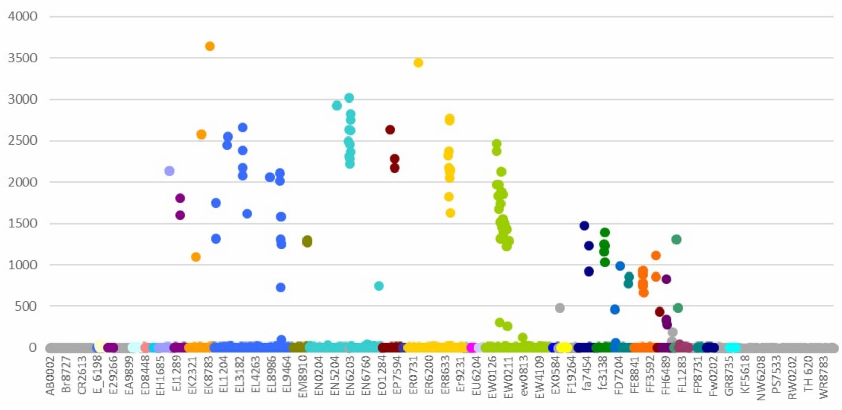
Figure 1
Even at first glance, it's possible to see patterns. The turquoise EN numbers are registering 12 batches with an incidence of between 2000 and 3000 adverse events. Then there is a huge drop, with nothing in between, and 678 batches in the 1-37 range. A random outcome? I don't think so. The problematic batch numbers are sequential, labelled EN6198 to EN6208 inclusive. They were released one after the other, there were no significant delays in their distribution and none of them were recalled by Pfizer. The EW (lime green), EL (navy blue) and ER (yellow) are very similar. ER has 11 batches with a range of 1570-3337 adverse reactions; the remainder have 22 or fewer. Once again, there is nothing in between. Batch numbers 8727, 8729, 8730, 8731, 8732, 8733, 8734, 8735, 8736, 8737, 2613. In total, there are 378 EL batches – 18 are highly toxic, 360 low or not at all, a rate of 5%. The following calculation is sobering:
“If 1 in 20 lots are toxic, and if each person has two vaccine shots each year, then -
after 1 year their chances of getting a toxic batch will be 1 in 10
after 2 years their chance of getting a toxic batch will be 1in 5
after 3 years their chance of getting a toxic batch will be 1 in 3
Of course, this assumes that the % of batches that are super-toxic remains constant at 5%.”(2)
I wonder whether this is the reason for the continued insistence on booster shots? To increase the odds of 'vaccine' injury from 20% to 33%? There is also evidence of a temporal pattern, as might be expected given the sequential lot numbers. There are four clusters of highly problematic Pfizer lots; 12 in the first, 3 in the second, 27 in the third and 21 in the fourth. All clusters were released in close temporal proximity and had a narrow range of toxicity, rather than a random spread which might be expected if the problem was to do with quality control. Finally, the clusters decline in toxicity over time.
Needless to say, all of these patterns have a uniform appearance, not one which indicates chance or misfortune.(3) There is also a suggestion that the vaccine manufacturers are colluding, as there is evidence that the production of the toxic batches and the subsequent shipping of them is co-ordinated – that when one company sends a hot batch, the other two are sending placebos. That particular snippet needs further amplification but, given the existence of the other evidence and of initial investigations which reveal that these batches were not just dispatched at particular times but used promptly also, it is likely that yet another unlikely coincidence can be established in time.
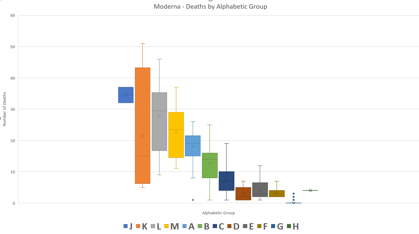
Figure 2
To add to the sense that the element of chance isn't getting much of a look in, Moderna's death figures also have a certain symmetry, do they not? By now, there is a theme developing. Each individual piece of evidence could, just possibly, have a stand-alone explanation that might withstand scrutiny, although patterns such as these are difficult to ignore. However, when taken together (with more to come), the list of coincidences and oddities becomes ever harder to explain away.
The next brick in the wall is the issue of lot expiry dates, which doesn't sound as if it could ever be compelling. However, not all the lots have expiry dates. In fact, the vast majority of them don't; which is curious, as is the fact that the list is a closely guarded secret, not to be trusted to the general public. If all of them contain the live biological agent, then they should all have expiry dates. One might surmise, therefore, that the expiry date is a non-issue for the bulk of batches and take a punt as to the reason for this. The lots with expiry dates are, exclusively, those with the highest number of adverse events.(4) It would seem that Occam's Razor is in play once more. The only reasonable explanation is that these lots are biologically active and that the remainder are almost certainly placebos, quite possibly saline, which would fit with the numerous reports of 'accidental' injections of salt water. Is there any other legitimate reason for this state of affairs?
There is no doubt, by the way, that the toxic batches are deeply pathogenic, or that the authorities are in full-on suppression mode. It's just not possible to keep every bit of unpleasant data hidden in a pseudo-democracy. There are still entities, usually government organs, whose job it is to go about their business in time honored fashion and publish reports in typical administrative state ways. Which brings me to Alberta, Canada.
It has long been known that governments have unilaterally decided to define 'vaccinated' as a state of grace that is only achieved 14 days after the jab. Ostensibly, the reasoning was that since it took that long to have the desired effect, it would be unfair to count adverse events which occurred in that first fortnight. What tended to be overlooked was the fact that the status of 'fully vaccinated' was only conferred two weeks after the second jab, thus rendering a period of perhaps six or seven weeks moot, rather than just two. The term 'partially vaccinated' could predominantly refer to those who stepped off the compliance train after one jab, but is much more likely to be made up of those who are halfway through the process.
Skeptics who recognized some of this blatant obfuscation were nonetheless surprised to find that, instead of these numbers disappearing into a black hole, they were added to the numbers attributed to the 'unvaccinated' instead. I had always assumed this to be the case and so it transpires. Almost half of all Covid hospitalisations of the 'vaccinated' occur within 14 days of dose 2 and around 80% occurred within 45 days. The statistics for untimely deaths are even more startling; 56% within 14 days, 90% by 45 days.(5)
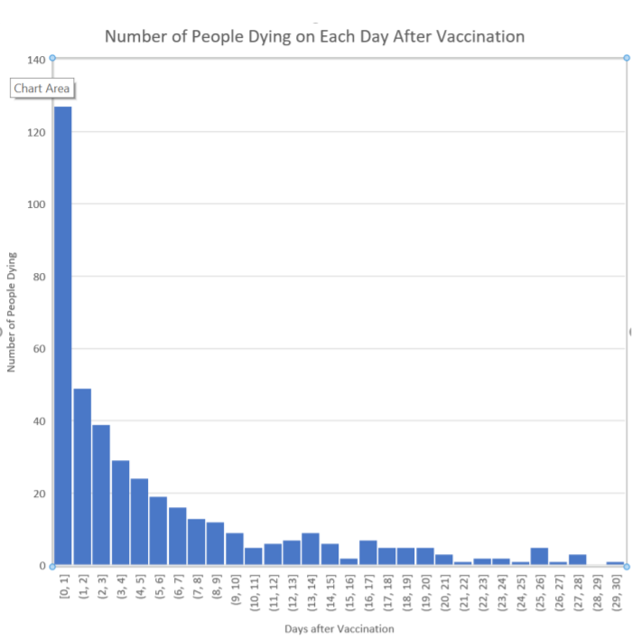
Figure 3
Alberta removed the data as soon as some apparatchik realized that doing his or her job properly was no longer appropriate, but confirmation of the instant lethality of the second dose particularly can also be found in VAERS data. The above is an analysis of the first 456 Pfizer deaths reported on VAERS (up to 28th February 2021), which were mostly cardiac events. How is it that the jab can be so toxic that large numbers of young healthy patients can sicken and die of cardiac failures within 24 hours and yet the overwhelming majority of recipients don't exhibit any symptoms at all? Are we to believe that these unfortunates all have undiagnosed issues that compromise their systems and that, additionally, the 'vaccine' seeks these weaknesses out?
Once again, as a stand-alone explanation that must be accepted without question, it might satisfy the incurious or the complicit. Except for the inconvenient issue of the highly toxic batches. What are the odds that those same batches also happened to be deployed on patients that nobody knew were ill? Or that all the other batches, with the same contents, were similarly used exclusively on patients with no hidden issues?
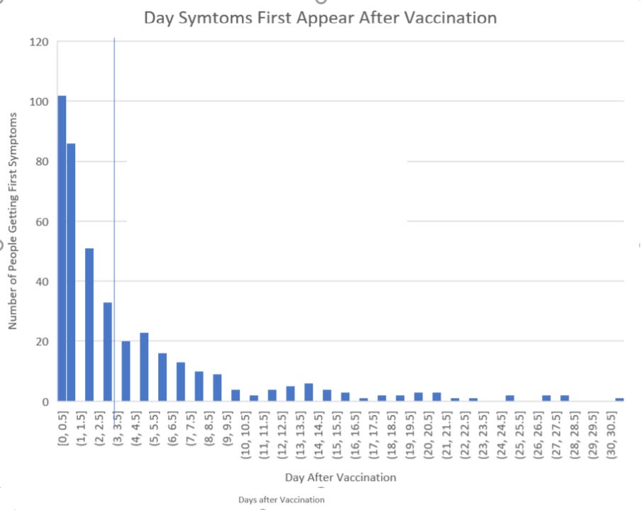
Figure 4
Vanishingly small is the answer, as Figure 4 demonstrates. There is clearly a pattern and that pattern points to causation, as if we didn't already know that instinctively. And when the jab didn't lead to death, but merely severe adverse events? What time frame was apposite in these cases? Let's ask Pfizer:
Adverse effect Number of cases % of all cases Median time til onset
Heart attack 1406 3.30% < 24 hours
Hemorrhage 932 2.20% 1 day
Facial paralysis 449 1.07% 2 days
Auto-immune 1050 2.50% < 24 hours
Arthritis 3600 8.50% 1 day
Convulsions 501 1.20% 1 day
Herpes 8152 19.40% 1 day
Blood clots 151 0.30% 4 days
Strokes 275 0.60% 2 days
Table 1 Pfizer's own document
This was not a document that was ever supposed to see the light of day, but it is their own analysis of adverse events over the same time frame. Thus, we can clearly see what the arbitrary definition of 'fully vaccinated' is designed to conceal, which is the majority of injuries and deaths and, in the process, a strong causal link back to the jab.
One notable incident of dissonance between the official line and other data that is seeping out, is the contrast between VAERS, which shows a decline in adverse events as time has passed, and the anecdotal evidence reported by those close to the action, not to mention other data published by those same official sources, which indicate that the jabs are as toxic as ever.
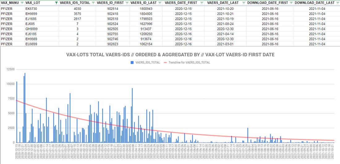
Figure 5
There is another theory. This one posits that it's not that the 'vaccines' aren’t as dangerous as ever; it's just that the CDC and the FDA stopped counting the adverse events and actively suppressed reporting; a practice that is charmingly referred to as 'curating the data'.
The chart itself doesn't prove anything. It might if we could trust the CDC and ignore the vast trove of whistle-blower accounts which speak of active suppression of reports upon pain of losing a livelihood. Still, let's go through the motions, anyway. One of the obvious possible explanations can be dispensed with immediately; it wasn't just the old folks dying at the outset. The average age of the fatalities linked to two of the worst Moderna lots was 51 and 61 respectively.(6)
A further clue can be gleaned from the fact that the vast majority of the more deadly lots were administered in the first three months of 2021.(7) In and of itself, that doesn't settle the debate, either. Whether intentional or as a result of horrifically compromised manufacturing procedures (subsequently corrected), what appears to be a pattern of improved safety is not yet undermined by other evidence. However, there is another piece of intelligence that lights the way, potentially, but one has to look at the international picture to find it.
If the US experienced an alleged drop off in adverse events as time passed, the same could not be said of other countries. Australia, for instance, did not record any problems with the 'vaccines' from the start of their initial campaign until early July. Then things went somewhat awry.
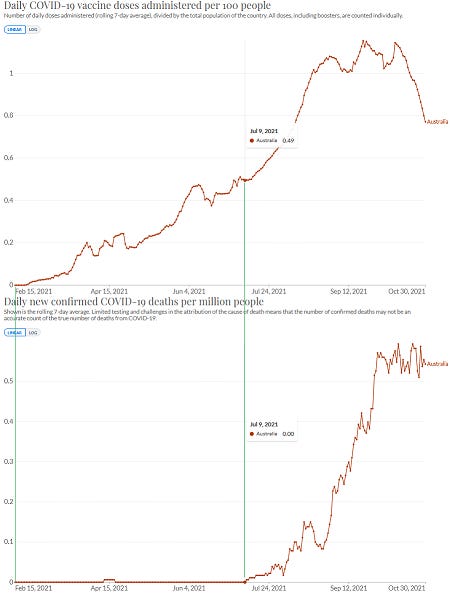
Figure 6
There are other countries with a similar distribution, Romania among them. There are yet others with the much more explicable spikes in deaths in the days after 'vaccination'. So why is there a mammoth delayed reaction in some and not others? The two most obvious explanations are that some doses are more deadly and/or there is a concerted effort to cover up the deadly effects of the 'vaccines'. If the former theory still holds water, then it's possible that doses shipped internationally in the second half of the year were the deadly batches and that, simultaneously, more placebos or benign shots were distributed domestically in the US.
This would indicate that the cause of their toxicity was not quality control problems, after all. Why would quality suddenly be better in the US but worse for the ones sent to Australia and Romania, among others? The second theory is still live, though. It could still be that there was no change in the lethality of the doses in the US, just a concerted effort to cover them up. There is evidence for this; the now viral Zoom call from the Indiana life insurance CEOs, bemoaning the 40% increase in working age adults through the third quarter of 2021.(8) Perhaps a look at US excess deaths might assist?

Figure 7
According to the official line, there was an increase of 15.2% (462,412 deaths) over the expected rate, to go with a 13.6% increase the year before, which doesn't indicate that the 'vaccines' have done anything beneficial but, given the similarity to 2020, there is no extra 'vaccine' signal in plain sight. Plus, of course, the law of intended consequences has played a role, as drug overdoses, suicides and incidental deaths from untreated conditions such as cancer have increased noticeably.
However, it seems clear that 2020 was a year when governments were very keen to ensure that a lot of vulnerable people died, hence the need to flood nursing home with Covid patients, to offer close to $100,000 a pop for a Covid ventilator death and to deny people early treatment that would have saved their lives. By contrast, 2021 was supposed to be the year when the 'vaccines' eliminate the 'pandemic'. As is so often the way, another look at the data tells a more complete story:
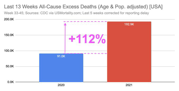
Figure 8
That rather solves the puzzle, I believe. While VAERS can be cleansed, causes of death can be faked, hospital staff can be intimidated and commentators can be cancelled, the data that the government itself publishes undermines its own narrative. I think it highly likely that adverse events have continued unabated and that the state is ensuring that they are not properly recorded on VAERS. If this is the case, it doesn't invalidate the hypothesis that only some batches are lethal and that others are likely placebo, nor does it mean that there has been a precipitous falling away in toxicity over time. It just means that the data has been rendered incomplete and will remain so from here on in. But some indicators will still be apparent. Vermont, for instance, the most vaccinated US state:

Figure 9
Or good old Blighty:
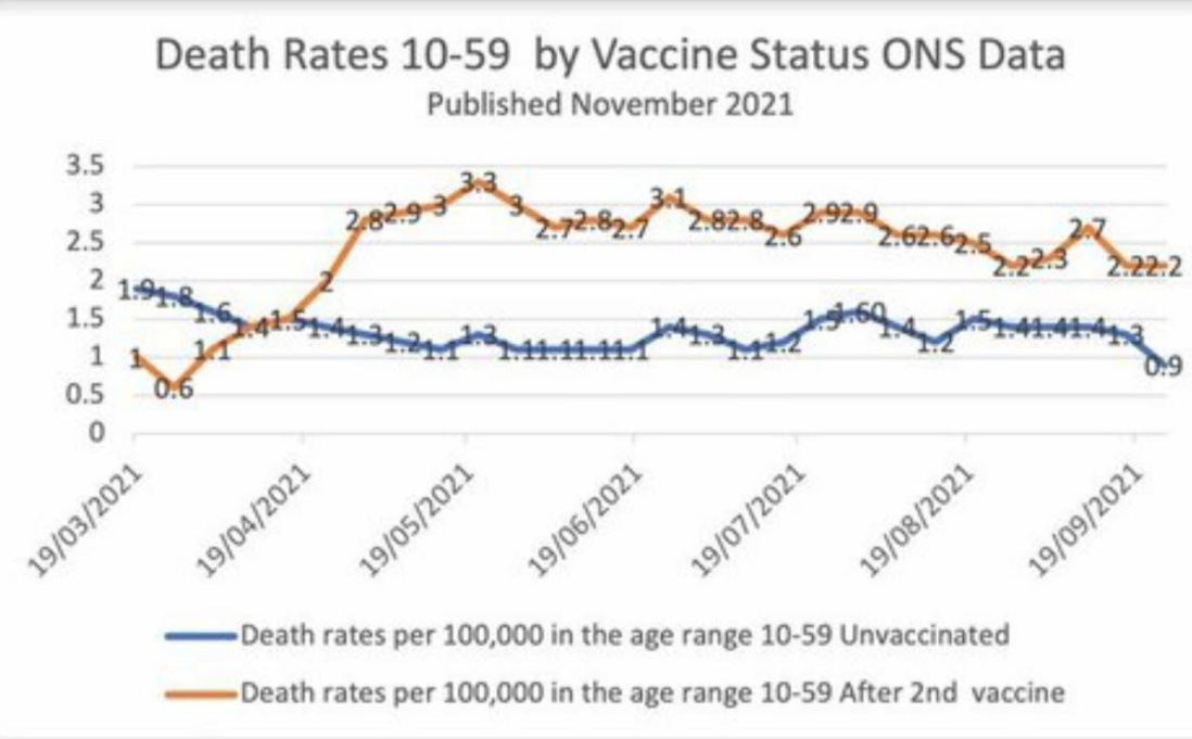
Figure 10
There doesn't appear to be a sudden reversion to the mean in the second part of the year, which mirrors the US trend and provides yet more circumstantial evidence for the continued use of deadly jabs. Remember, most initial deaths are within 14 days of inoculation. According to the ONS, the vaccinated are over twice as likely to die as the unvaccinated and deaths overall are running well above normal. The same is true of Europe:
“An alarming rise in excess mortality among people under age 65 in 2021. In 29 countries in Europe, excess mortality in the last four months for people age 15-44 is running at nearly double what it was in 2020. For age 45-65 it is more than 50% higher, and age 65-74 some 40% higher. This is despite (or because of?) vaccination rates of at least 70% across Europe. In the USA, all-cause excess mortality is about 50% higher (so far) than 2020, but for people age 25-44 and 45-64 it is about 85% higher; for people under 25 excess mortality is nearly double last year. The only age group that died in smaller numbers this year in the US were those 85 and older.”(9)(10)
What does it all mean? I'm still trying to get my head around it, to understand all the possible ramifications, but there are some judgements that can be rendered with confidence. Firstly, we are looking at patterns that have a design behind them, evidence of deliberate malfeasance.
We are also looking at a confusing picture, as to exactly what it is they have done and, from that, what particular flavor of malevolence is being manifested. There is the probability that a minority of the vials are extremely toxic and that the vast majority are placebos. This would fit with several logical elements of the overall picture; for instance, it would explain why only some people are affected and some have no reaction at all.
It would explain the fast action of the pathogen and the obvious causation between jab and injury. It would also explain the sudden shift, in some countries, from a trouble free roll-out to an epidemic of 'vaccine' injuries that governments are scrabbling to hide and it would explain why other countries had those issues from the start. It would make sense from a tactical point of view; too much disaster too soon would, in all probability, put the brakes on the whole experiment. Plus, a large number of 'vaccinated' presenting as untroubled is a good way of applying pressure to the unvaxxed. Citizen advocates, such as these, have been a feature of other scams over the years.
The data show what closely resembles a dose testing protocol, to see where our human limits are. It's possible that the dosing was too high to begin with and that toxicity has been reduced over time, although the effect on injuries and deaths is probably negligible, inasmuch as excess deaths are way above historic norms in the latter part of 2020 too. In this scenario, any longer term mass depopulation attempt would have to come from multi-dosing with boosters, whereupon one's luck would eventually run out.
This theory would tend to kibosh the more apocalyptic vision of 70% of the population succumbing to disease after the first two shots. I say that, but realistically, long term effects cannot be divined, so we cannot be certain. And it's true that a successful push to 'vaccinate' us all, which is certainly what we are seeing attempted, would eliminate a control group. It's also true that there is no way of tracing individual vials, other than the bar-coded method available only to the manufacturers. In fact, the 'vaccine' manufacturers expressly forbid any additional identifying markers being added to lot numbers or vials; another peculiarity that obscures patterns, rather than illuminating them.(11)
The data around US state distribution strongly suggests that Big Pharma is in bed politically with an entity that is not the Republicans. Whether that can be said to be the Democrats, the administrative state or the elites (or, indeed, all of the above) is unknown to me, but when an effect can be seen that has some consistency over a data set of 50 states, I think we can be confident that we are onto something.
So, is this all definitive proof of further malfeasance? By that, I mean in addition to the fact that the biological agents that have been shown to be present in at least some of the 'vaccines' are known to be toxic to human beings and also the fact that these are experimental gene therapies that are not effective and could never be so, by the very nature of their action. It comes down to the question of how much evidence do you need? Do you need every last detail pinned down before accepting a hypothesis, because this mindset is frequently representative of a desire for avoidance; not just a repudiation of the probable truth, but a neglect of inquiry into circumstances that obviously warrant it.
An intelligent person who is not innately biased, on examination of the above circumstances taken together, will conclude that something is amiss. Randomness falls on both sides of an equation eventually and yet the pattern here is consistently nefarious. Alternative explanations, such as faulty quality control, seem partially valid at first blush, but don't stand up to scrutiny when other elements of the scenario are added to the mix. 'Hot' batch production, the evidence of temporal and geographical distribution of same, obvious tampering with and concealment of data, a failure to address any of the above and a willingness to trash anyone who seeks to question the narrative are all actions that, taken together, can only realistically demonstrate a clear intent by a combination of drug companies and the authorities to injure and kill specific groups of people. And this effort is ongoing.
Citations
(1) https://howbadismybatch.com/states.html
(2) https://www.howbad.info/allnothing.html
(3) https://rense.com/general96/toxic-01.pdf
(4) https://howbadismybatch.com/cdcexpiry3.pdf
(5)
(6) https://market-ticker.org/akcs-www?post=244109
(7)

(8) https://thenewamerican.com/report-excess-deaths-up-40-percent-among-americans-18-49/
(9)

(10) https://www.euromomo.eu/graphs-and-maps
(11)

Figure 1 https://www.howbad.info/allnothing.html
Figure 2 https://www.howbad.info/clusters.html
Figure 3 https://www.howbad.info/time.html
Figure 4 https://www.howbad.info/time.html
Figure 5
Figure 6